It’s hard to get noticed online isn’t it? Even if you have an objectively better product or service, you’ll always be outpaced by a company that knows how to market itself. In these types of situations, it can be especially important for you to create a personal logo to go with your brand. Along with helping you build your business brand, a good personal logo can go a long way in making your brand appeal to other consumers.
So if you’re really looking to build your brand better, here’s a quick guide to how you can create a personal logo that sticks out.
Tips to Making Your Personal Logo Stand Out
A personal logo can go a long way in helping your business stand out from the rest of the competition. But making that personal logo can difficult, unless you have the right guidance. Here is a quick look at some tips that should get you up and running:
Decide What’s Going on the Logo
The first thing that you really want to do if you want to make this process any easier is to decide what you’re going to put on the logo. Are they your initials? Is it an object closely associated with your brand? Or is it just your name? There really is no limit on what you could put on your logo. However, you need to first decide on something before you move forward. And even if you don’t like it, you can always digitally replace what you’ve added and try something new.
Consider Your Profession and Industry
While you’re deciding what goes on your logo, you’ll also want to consider your profession or industry to make sure that you get it right. A logo is a visual representation of your company’s values, beliefs, commitment to quality, and so much more. But it’s also a visual representation of what kind of business you are.
While it can be pretty cliche for doctors to add a stethoscope to their logo, it lets viewers know what the business is about. You’ll be surprised how many people can be turned off by the lack of visual cohesiveness.
Try To Avoid Cliches In Your Design
So about those doctors that use a stethoscope in their logos…
For all intents and purposes, cliches form for a reason. And in this case, a stethoscope is a good visual representation of the services that they offer. However, using cliches can also make it a lot harder for you to stand out from the rest of the competition.
People eventually become desensitized to symbols like a red cross, stethoscope, white coat and so on. You really need to think out of the box if you want to get people’s attention.
Find Out the Right Type of Logo for Your Business
Now that you know what’s actually going to be on your logo, it’s time to decide on it’s overall style. You can choose from a wealth of Logo designs, each one representing a unique aspect of a business. Are you going for plain text for something a little more minimalist, or do you want something that’s more abstract? It really does depend what you want and what you’re trying to make your audience feel.
An abstract logo let’s you say a lot about your business without having to say anything. On the other hand, the last thing you want to be is abstract if you’re a business that offers a specific set of services. Remember to choose a design that is a lot easier to understand.
Try Going Minimalist?
Again, this really does come down to personal preference. A minimalist design can be a good representation of your business’s best values, or it could be incredibly boring. Not everything needs to be minimalistic to be good. But that’s not to say that you want to get too wild with your colors and fonts. Keeping a simple design reduces the risk of people getting confused by your logo, or it looking overwhelming. Remember, if a logo is simple and easy to understand, then it also becomes easier to remember.
Pick the Right Colors
Not every logo needs to be a sharp contrast like black and white, but you still want to make sure that you don’t overdo it. Colors tend to connect with people emotionally. And by using the right colors, you can better communicate with your audience and associate certain emotions with your brand. For instance, McDonald’s yellow, which gives people a reassured and happy feeling.
The right colors can also make you stand out from the competition if you still have a somewhat similar design.
Make Your Design Scalable
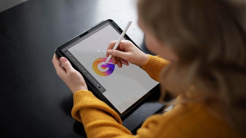
The mark of a really good logo is that it’s versatile in how you scale it. You’ll likely be using your logo in various places. You could use it on your website, social media accounts, or even merch. And if you have a bigger logo, scaling it down can give you a lot of creative liberties in how you express yourself. For instance, Google’s logo is just the company’s name with each letter having a unique color. But when they scale the logo down, it’s just a G that has all of the colors of the Google logo. It’s creative and it gives you a lot of leverage in how you express yourself.
Use a Logo Generator
Now you can get a lot of opinions from people about what they think about using a logo generator. However, it’s still a useful tool when you’re looking for ideas. While most people are concerned about theft of the original artist’s work, some generators only only use copyright free material as the training model. So what does that mean? Well, there’s no stealing involved, as the creators of the artwork have given permission to people to use it.
Conclusion
Building a brand can be surprisingly difficult, especially if you’re just starting out. But one of the most important aspects of a brand that you should start working on as soon as possible is your logo. It doesn’t just tell people more about your business, it’s telling them more about you and the values that you hold. And with these tips, making a new personal logo can be a lot easier.